


Be brave. Stand out.
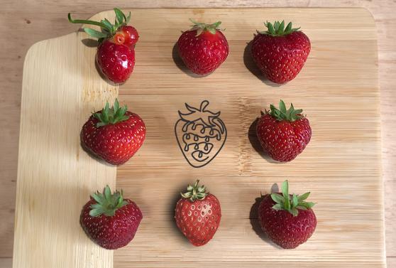
Chair, table, lamp, stool, strawberry, desk, bed. Give this list to 100 people and ask them to recall one word – most are more likely to say ’strawberry’.


It makes perfect sense. ‘Strawberry’ is different and unexpected compared to the other words. It stands out the most in that list and so is more likely to be remembered. This effect, where similar stimuli are presented along with one that differs is known as "The Von Restorff effect" or the "isolation effect”. It has been seen in studies since 1933 and widely used throughout marketing – think Levi’s launching black jeans against a sea of blue denim in 1982, famously saying 'When the world zigs, zag.'
In ever-increasing competitive marketplaces and sectors, standing out from your competitors is more important than ever. Whether it’s to increase sales or raise awareness, looking, sounding, and behaving differently can be the key to being more memorable.
So when it comes to branding, you should be brave and look for ways to do things differently. By delivering distinctiveness, even in traditionally the most conservative of sectors, your customers, partners, and audiences will recall your brand over others and will ensure that you gain an advantage.
If your industry or sector is awash with blue, why not wear yellow? Or pink. Or orange. The unexpected colour choice will make people sit up and take notice. How brave, braver, or braver still you become depends on a number of factors, but just because you might need to look a certain way doesn’t mean you can’t still do things differently. If you’re in the strawberry industry and want to show a strawberry – does it have to be red and green for people to know it’s a strawberry?
If you need to ‘fit in’, it doesn’t mean you can’t ’stand out.'
For our work with the National Audit Office, we worked to create a bright, vibrant and energetic brand for their Young Eurosai Conference. In what could have easily been a safe and corporate-looking conference, we took a bold approach to the visual identity that would resonate with the younger audience in attendance and bring the conference’s theme to life.
See our case study here.