


Supporting water consumers with a clearer, more approachable digital experience
The Consumer Council for Water (CCW) is the independent voice for water consumers across England and Wales. They asked us to support their website redesign, beginning with in-depth user research and continuing through user-centred design and development.
The key challenge was to create a digital experience that could serve a wide audience — from homeowners looking for advice on bills and water efficiency, to business owners navigating more complex regulatory and performance information. The site also needed to make a wide range of tools, data, and advice more accessible, while meeting modern accessibility standards.
We began with a stakeholder workshop to align on CCW’s goals and review existing insight. Combining this with analytics, survey data, and a usability review of the current site, we developed a UX report to highlight opportunities for improvement.

From there, we ran a co-design workshop with CCW stakeholders, mapping research findings in Miro and using creative techniques like rapid sketching to generate design ideas. These informed our design sprint process, focusing on key journeys such as navigation, the homepage, the water-use calculator, and advice sections.
We prototyped new designs, recruiting users to test and refine them iteratively. This testing provided critical insights into journey maps, usability challenges, and design refinements.
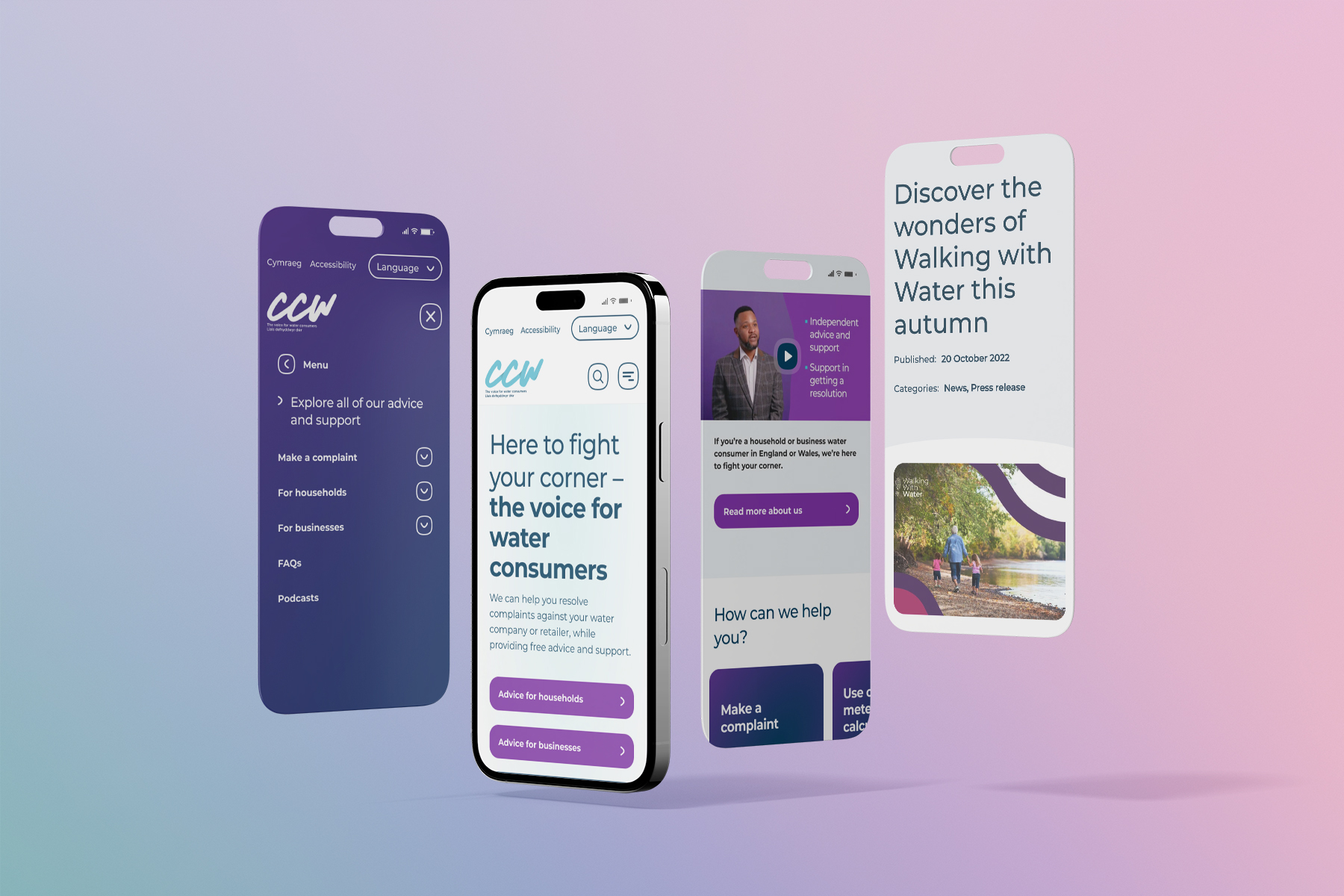
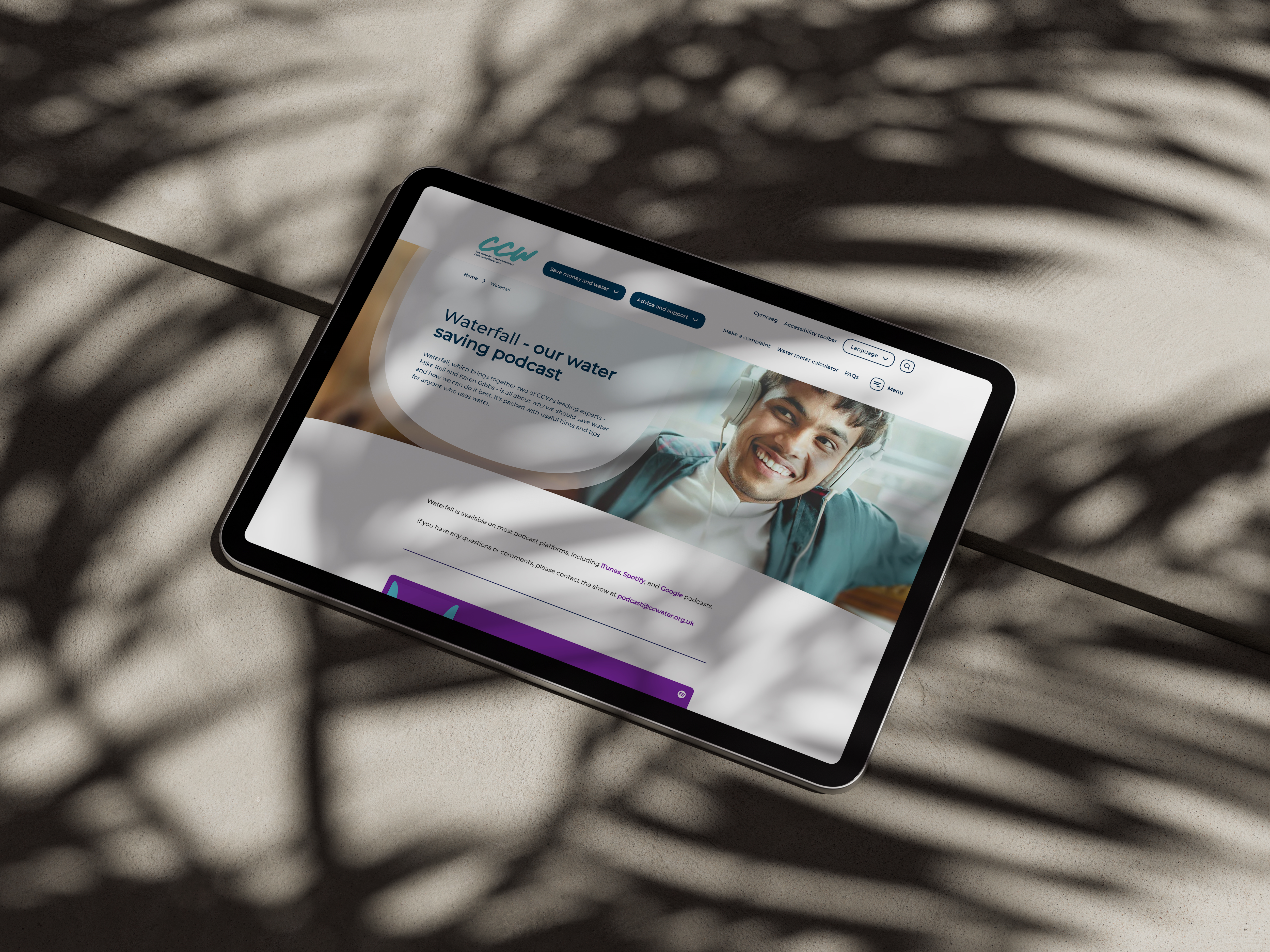
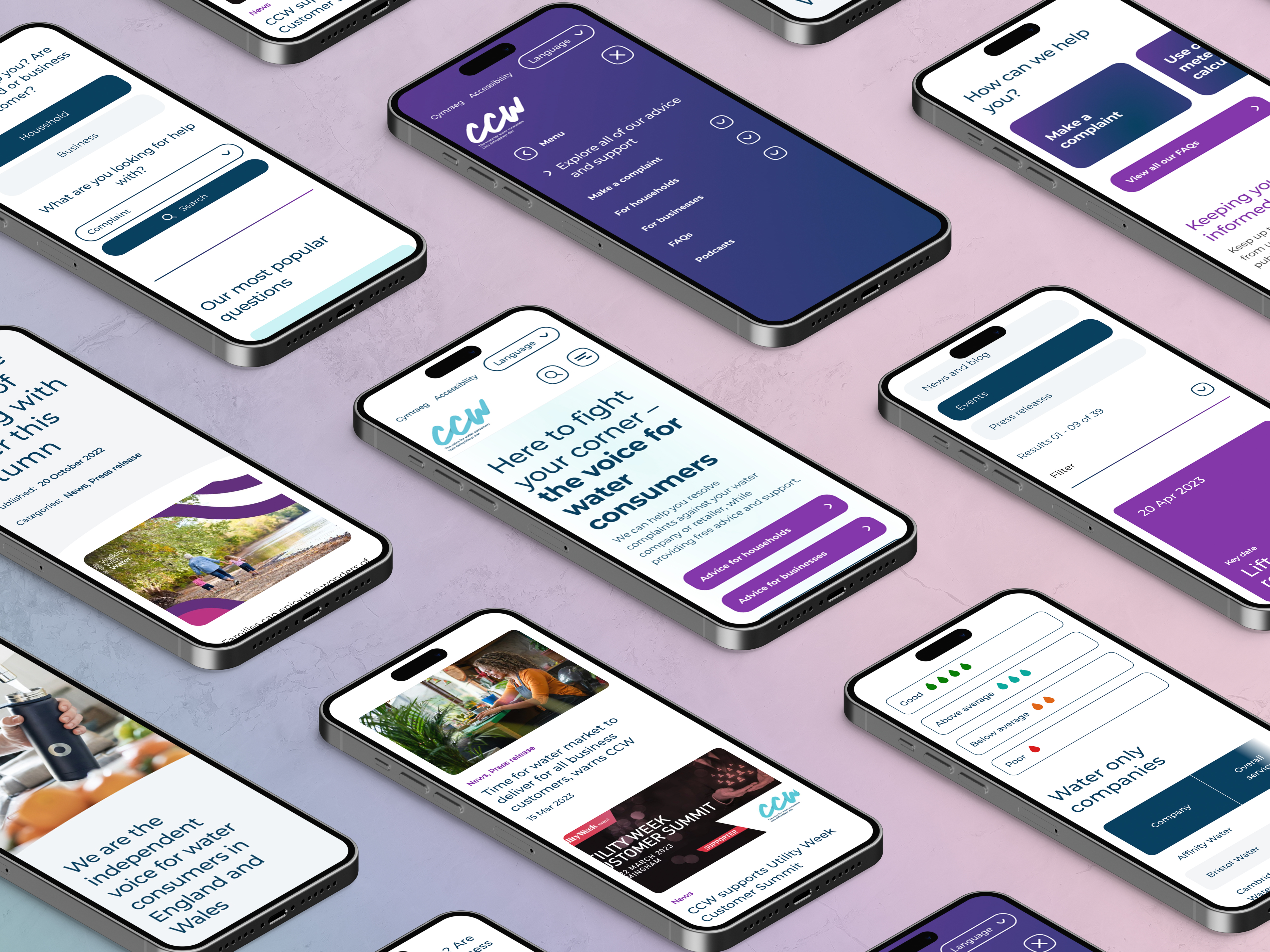
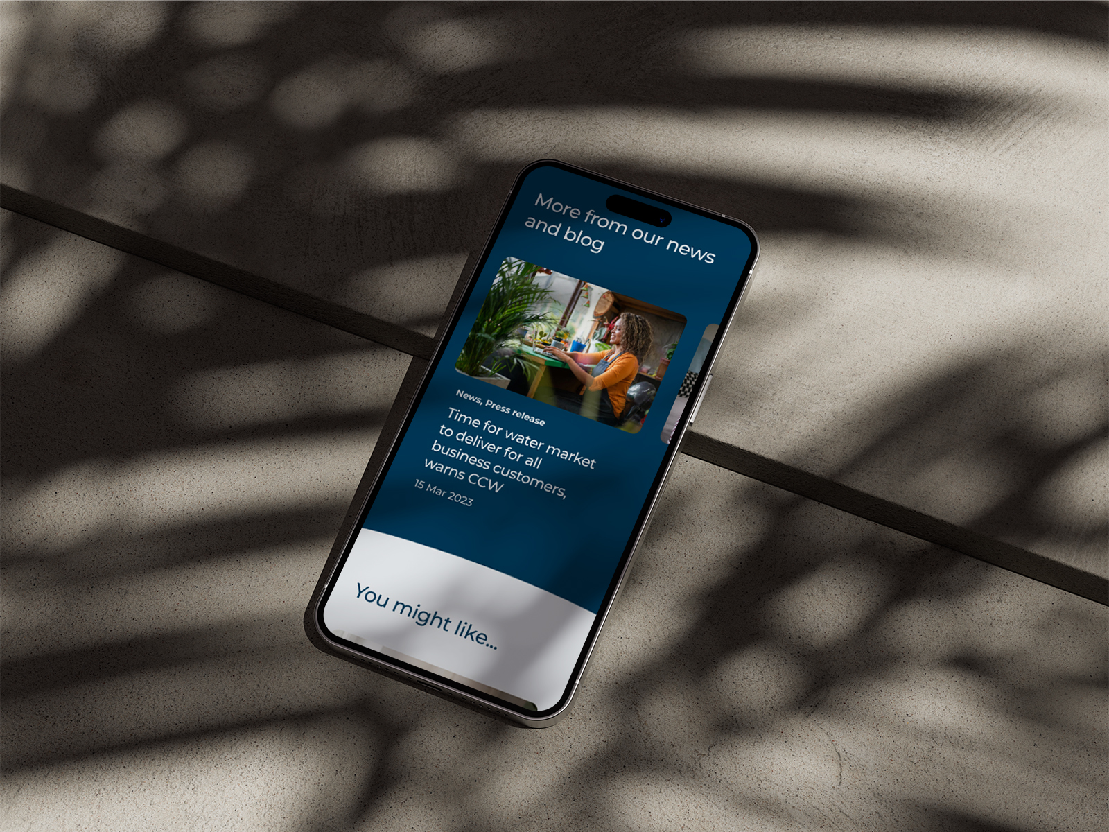
Working within the CCW brand, we introduced a softer and more approachable visual identity. Softer tints from the existing colour palette created a calmer tone, while a suite of custom icons with large curves and rounded edges gave a friendly, accessible character to the site.
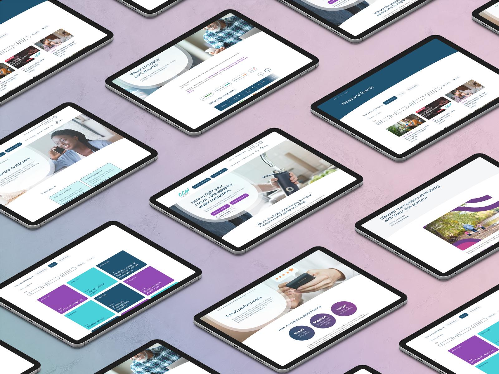
Layouts were deliberately clean and simple, using white space to guide focus and improve readability. Large curved section edges and subtle shape overlays on image headers added distinctive visual elements without compromising usability. The result was a design system that balanced visual impact with clarity and trustworthiness, ensuring content remained easy to navigate and digest for all users.
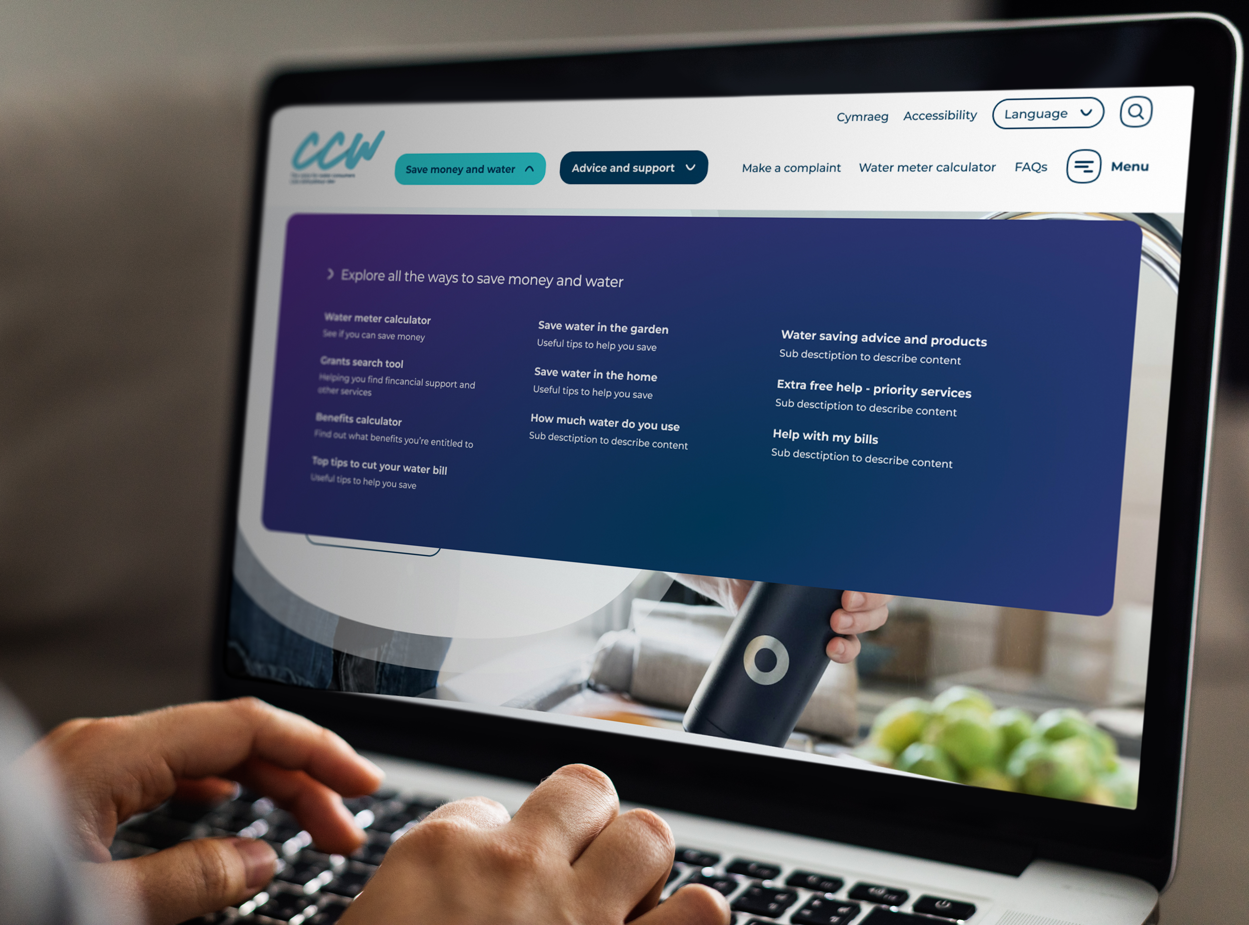
The new CCW website launched with an innovative navigation structure that clearly distinguishes journeys for households and businesses, making it easier for both groups to find relevant advice. A redesigned water meter calculator and interactive visualisations of company performance and complaints journeys provide clarity and accessibility, meeting WCAG AA standards.
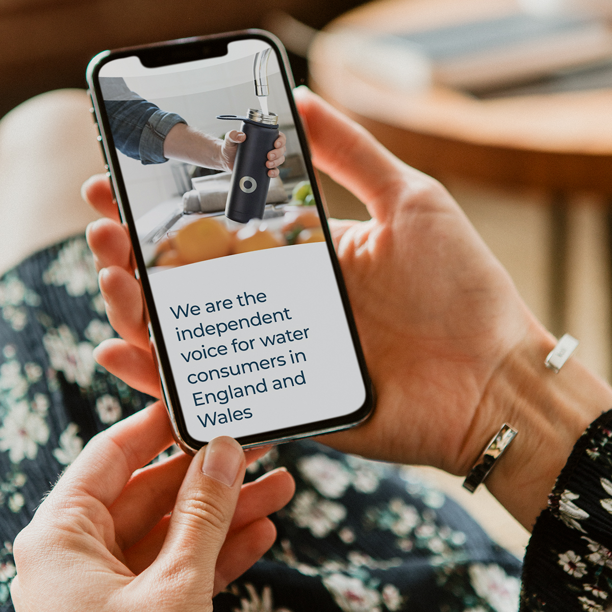
The end result is a modern, welcoming website that makes complex information simple, supports users with practical tools, and reinforces CCW’s role as a trusted, independent voice for water consumers.


Designing for creativity. Redefining the Edinburgh College of Art website

Creating a digital home for the Royal Navy’s history and stories