


Using visual design to help users reach their goals
Normally when we use a website, we’re using it with a purpose in mind, whether that purpose is to do some online shopping or to have one last look at the brunch bar’s menu - we typically use the website to help us complete this goal.


With that in mind, users want the information they’re looking for to be laid out in front of them, as simply as possible, all while knowing which options they have at each stage of the journey.
An effective content structure and visual design of a website or digital product is the icing on the cake to presenting these options clearly to your users, allowing for that seamless user experience us UX designers strive to deliver.
In this blog, I’ll chat through the designer’s role in helping guide your users to where they want to be. I’ll showcase a few examples of particularly effective visual design and will discuss how they help their users navigate a website successfully.
Understanding your users’ goals
At the start of a web design project, you’ll want to understand the users and the journey they’ll make before, during and after using a website or digital product.
This stage is really important as it determines which content is most important on each page, and it gives us an idea of how that information can be presented. Of course, this is an iterative process which will likely involve testing the website structure by defining an Information Architecture (IA), but we’ll not go into too much detail about IA in this blog!
So, once the website structure has been tested and validated, the primary path forward should be made clear as this is ultimately what needs to be made obvious to the user. If the website is e-commerce, for example, this may indicate that the emphasis should be on the sellers’ products.
On a news site however, where there isn’t one primary transaction, it’s likely that there will be more of a flat hierarchy of content, and the website layout and structure should reflect that.
An important note to make when deciding on the order of content is that users won’t typically scroll past the section they’re looking for, so be careful where you position that primary progression route to the next stage.
On an order confirmation page, for example, as soon as a user sees that ’Proceed’ button, they’ll likely click straight away rather than read any further information. This isn’t necessarily a problem, but we need to make sure that any important information you want your user to see is positioned above your call to action and is prominent enough, so that the user is much more likely to notice, read and understand the content before moving forward.
Designing interactive vs static content
When considering interaction design, the role of the designer is to inform the user about what options they have available at each stage of their journey.
Building design patterns allows users to learn the website’s functionality and behaviour through a consistent use of styling within interactive areas. Allowing these areas to be seen and understood clearly is helpful, rather than hiding them away with discreet styling and muted colours that blend into the background.
If the webpage features a modal pop up, let the user know how to minimise or close this section by making that ‘X’ icon obvious, rather than hiding it away in the background somewhere. If possible, help the user even further by adding additional labelling to eliminate any confusion about the icon used.
Have a look at dribbble.com as an example (a social media platform for digital design). The modal design hides the ‘X’ icon in the very top right corner, almost certainly so the design on show takes centre stage. However, this decision makes it more difficult for new users to find that close button and could make navigating the website harder, especially for those who might not know where to look, or for users who may have limited sight.
Small tweaks to the UI can make a massive difference between a user being confident in navigating a website or possibly getting stuck and frustrated that certain functionality doesn’t behave how they might expect.
The other side of the coin should also be considered when designing interaction areas, and this is the styling of static content. There should be a clear separation in visual design between content that can and can’t be interacted with.
Referring back to the previous section where we discussed building consistency in design: this helps us out here in allowing the user to learn the design language of the website so that they’re confident that they understand the functionality and aren’t missing important information.
Static content (backgrounds, body text and other non-interactive sections) should avoid using similar styling and/or colours of the main interactive elements of the website. Doing this will help the confidence of the user by making the content on show easy to understand.
Dark UX patterns
Have you ever experienced those frustrating moments where you try to unsubscribe from a spam email, or where you’re told that 30 people are currently viewing the 5 remaining items left on an online sale? These are referred to as dark UX patterns and companies often use them to make the user’s task more difficult, especially when it goes against business goals, like sending email ads or using the fear of missing out to try to push for that sale.
Sadly, web design can’t always be 100% focused on the user alone and often business requirements have to be considered when determining content hierarchy, which is why you’ll see these tactics used.
However, as UX designers, our role is to make sure that user needs always come first and that their tasks aren’t being deliberately made more difficult because they don’t suit the business goals. This can be done by presenting all options available to users and by clearly labelling ‘call to actions’ so that users understand what will happen next in their journey.
Examples
Here are a couple of website examples that have effectively used visual design to enhance the user experience by understanding their user goals and then making design decisions to accommodate these based on research:
Fjallraven
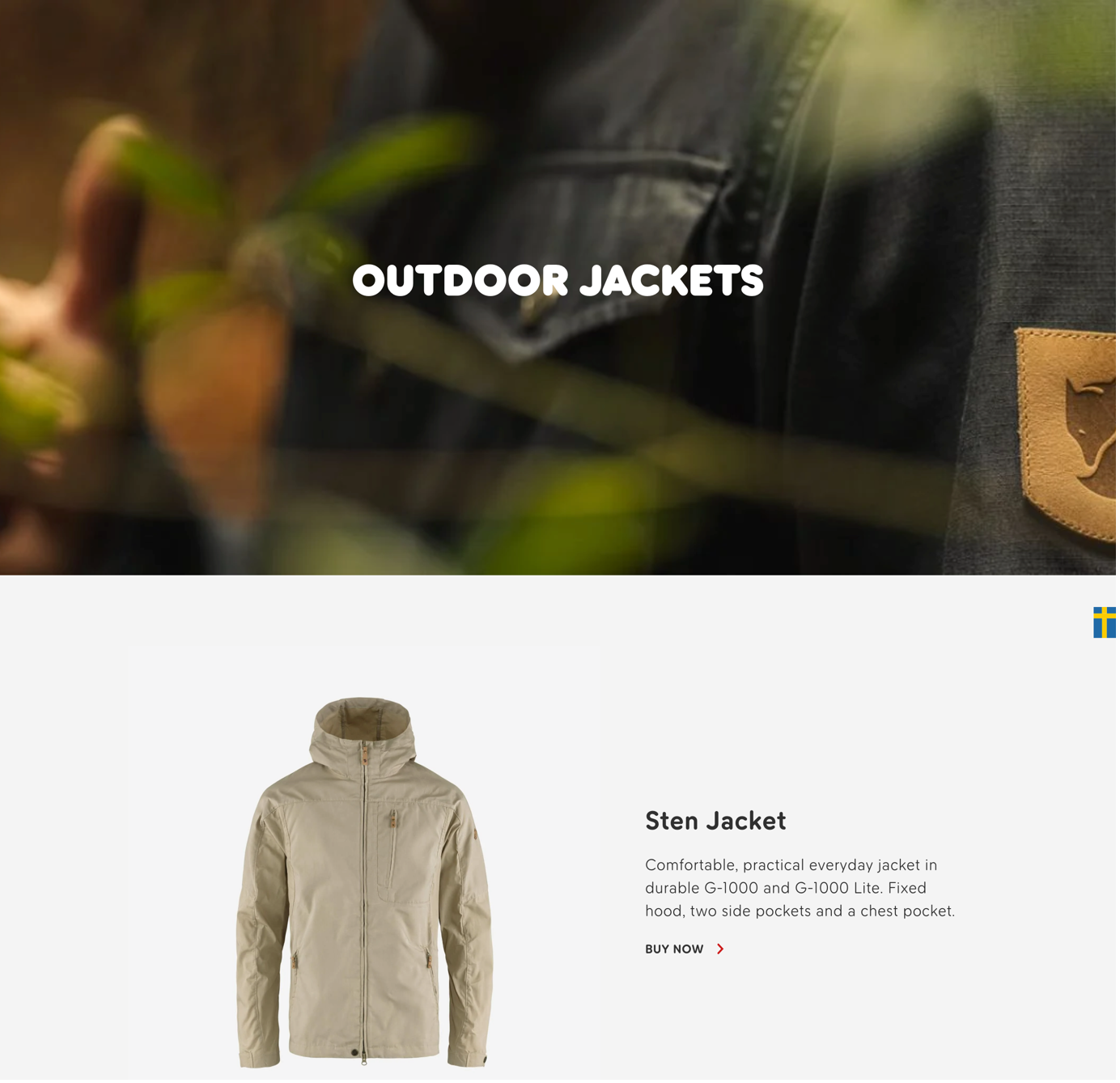
The outdoor clothing and equipment brand Fjallraven have applied an effective use of ‘call to action’ button styling and labelling when used over imagery. This helps to make it clear which sections are interactive.
Websites use imagery, both as purely decorative features and also as a button - or part of an interactive section - which can lead users to become confused about what they can and can’t click on.
The design of the Fjallraven website takes the interaction away from the image itself and features an additional ‘call to action’ positioned above which acts as the route forward. This provides a very clear narrative to users about what they can interact with as they browse the website.
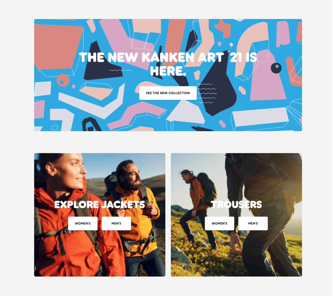
By understanding the customer journey, Fjallraven have used this design pattern to effectively streamline the number of steps taken by being aware that their users will need to filter between the ‘Mens’ and ‘Womens’ clothing range. This allows the website to be more flexible about directing a user to their desired location, in much fewer clicks.
After clicking onto the ‘Men’s jackets’ section we are led to the following page, featuring an image with similar header text as before, but with no ‘call to action’ button present. Thanks to the clear design language used previously, the user is aware that this section isn’t interactive and is instead being used as a section header.
Made
Websites usually have a few different ‘call to action’ button styles that can be applied for various reasons depending on the situation, the function, or if it’s a primary or secondary button. The plan when designing these buttons is to use consistent styling throughout the website for elements with the same functions. However, this isn’t always the case and it can become a real problem for users if this consistency gets out of hand.
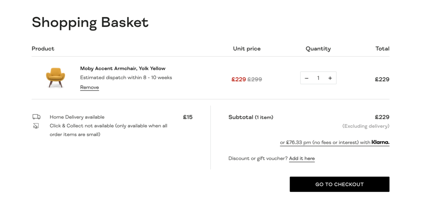
made.com provide us with a clear, effective use of button styling when it comes to the main user flow of the website, which is ordering a product. The reason this example is particularly effective is because they reserve the primary button styling only for those last few stages of the ordering process. This gives the user a clear direction on how to proceed when they’ve found the product that they’re looking for.
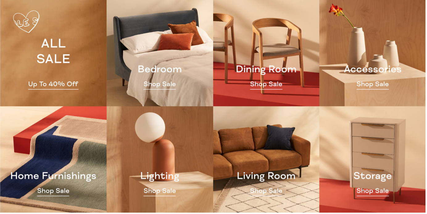
While browsing the homepage, menus, and product ranges, the button styling is fairly minimal with underlined text, as seen below.
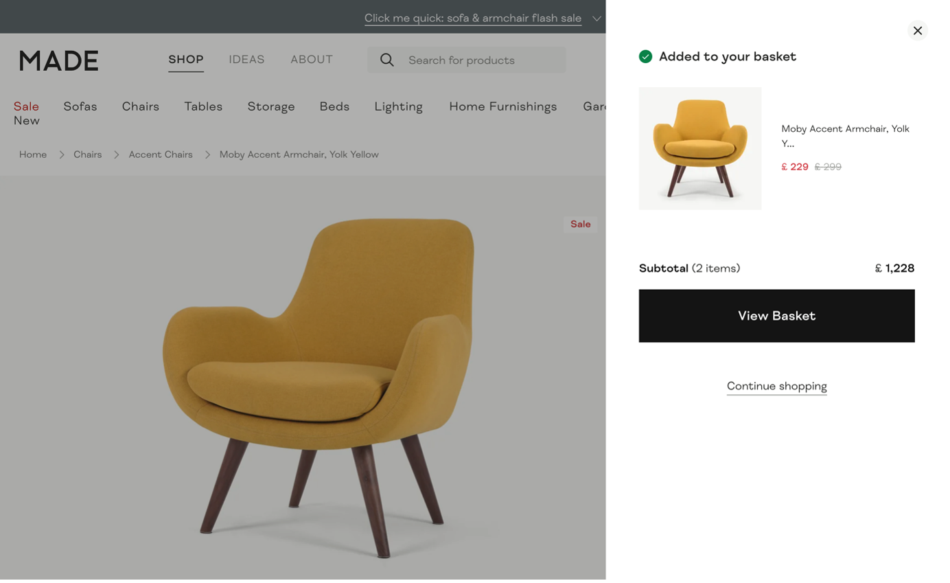
However, when you get into an individual product page, where the user journey starts to pick up towards the order transaction, we now see the primary call to action labelled ‘Add to basket’ with a solid black fill and white text.
Before this point, the user hasn’t seen this button styling being used, but given the clear prominence over the other text and interactive sections on the screen, it becomes obvious to a user that this is how to progress forward with the order.
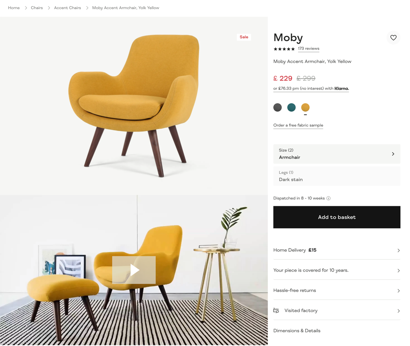
I find this example quite interesting because the decision to reserve this button styling until now allows it to draw the users attention, and in doing so, it encourages the sale, all without using any colour at all!
The additional positive impact this has, is that the black button styling allows this to work with every single product made.com offers as it won’t clash in colour. Clever right?
This primary button styling then features at every stage of the order process, assuring users that they are on the right path to completing their purchase, which is all achieved by effectively guiding the user to their end goal of ordering that new product!
Closing words
As I mentioned at the start of this blog, an effective content structure and visual design of a website is only the icing on the cake to presenting these options clearly to your users. All design decisions are only effective if they work for your end users, and if they can understand and use your service.
To make sure that we achieve this, we have to base all product and design decisions on solid user research, considering accessibility needs throughout.
Discovering who your users are, what goals they have and what may prevent them from completing those goals will provide a great foundation to begin the product design process.
After this, you can then begin to uncover the opportunities you can provide with your service to design the journey that will help users complete their goals and ideally have a great user experience while doing so.
Take a look at our Discovery and UX services to see where we can help.