


Responsive images in Drupal
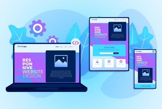
In this blog post we discuss how you can take advantage of Drupal’s built-in responsive image module to optimise page load speed on various devices.


Since version 8 Drupal has added responsive image to its core modules providing a powerful option to optimise websites. When we talk about responsive images, we mean serving the browser a version of the image specifically resized to better fit the devices screen.
What we usually do is provide the image in the largest possible size and resize it using CSS to make it fit the available space. In contrast, the idea behind responsive images is to serve the image resized in dimensions as close as possible to the available space it'll take.
How it works
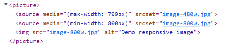
The main functionality of the responsive image module is based on HTML5 picture and source elements as well as srcset, size and media attributes. For each image element, we provide different source images and for each source, we define a media query to determine when it will be used. Based on those media queries and the current screen size, the browser decides which source to use to display the actual image.
This is an example of how the rendered DOM structure looks like:
Setting up breakpoints
The first step to use responsive images is to define some breakpoints. For this, the breakpoints core module should be enabled. The breakpoints are defined in a YAML configuration file called “{themename}.breakpoints.yml”, where {themename} is the name of the active theme. Core Drupal 9 themes already have those files in place.
The breakpoint file should list all the available breakpoints. Each entry in this file defines one breakpoint, consisting of a machine name, by which the breakpoint entry is uniquely identified e.g. bartik.mobile, and its children defining the breakpoint's properties:
- label - A human-readable label for the breakpoint
- mediaQuery - Media query, e.g. 'all and (min-width: 768px)'
- weight - Integer weight to order the breakpoint
- multipliers - Pixel resolution multipliers e.g. ‘1x’ for simple screens, ‘1.5x’ for android and ‘2x’ for retina screens
The order should be carefully used so that the smallest screen media queries have the lowest weight. It's recommended to write breakpoints in this order (smallest to largest) and keep weights in order.
A simple breakpoints file might look like this:
mytheme.small:
  label: small
  mediaQuery: ""
  weight: 1
  multipliers:
    - 1x
    - 2x
mytheme.medium:
  label: medium
  mediaQuery: "all and (min-width: 768px)"
  weight: 2
  multipliers:
    - 1x
    - 2x
mytheme.large:
  label: large
  mediaQuery: "all and (min-width: 1200px)"
  weight: 3
  multipliers:
    - 1x
    - 2x
Creating image styles
Once breakpoints are defined we create the image styles for each breakpoint that we're going to use. This can be done from the admin toolbar, selecting Configuration > Media > Image styles (admin/config/media/image-styles).
Add a new image style and apply any necessary effects (e.g. Scale and Crop) for each different image size that will be displayed.
Creating responsive image style
The next step is to set up the responsive image style. Go to Configuration > Media > Responsive Image Styles (admin/config/media/responsive-image-style) and click “Add responsive image style”. Give a descriptive name and select your theme from the “Breakpoint Group” dropdown options.
This should result in displaying all breakpoints defined in the breakpoint file with their multipliers variations.

Each breakpoint and multiplier combination may
- use multiple image styles, using the size attribute
- use a single image style
- do not be used at all
In the first case, you should add the desired image sizes (with optional media queries) and check the image styles to be used. The browser will pick one of the selected image styles depending on the actual size of the image.
Selecting a single image style will result in the browser using this style for this specific breakpoint. This is a simple and effective approach, since image size does not change dramatically between two breakpoints. Keep in mind to use the largest size that the image will occupy in this breakpoint and multiply by two for retina styles.
If a breakpoint isn't used, the image styles set for the next one will be used. If no breakpoint is enabled then the "Fallback image style" will be used.
Using responsive image styling
Now that we have the responsive image style in place it’s time to use it with an actual image field. Go to the “Manage display” section of any entity using an image field and select “Responsive image” from the Format drop-down list. Click on the gear on the right and select the required responsive image style.

Clear cache and check the results. The image will be served in varying dimensions for different screen sizes, based on the defined breakpoints and the image styles we created before.
Using responsive image style with media
If you prefer to use the media module for managing your websites images, you can still use responsive image styles as they can be applied to Image Media type or any custom Media type using an image field.
You just have to go to Structure > Media types > Image > Manage display and select “Responsive image” for the image field’s format.
In case you use the same Media type for different entities and would like to assign different responsive styles to each, you can use view modes. Open "Custom display settings" on the bottom of the screen to enable other view modes or create new ones (follow the "Manage view modes" link or go to Structure > Display mode > View modes > Add view mode).
Once you have enabled the required view modes, you can assign a different responsive style for each. Then, for each entity type using a media entity reference, go to the “Manage display” tab, change the format to “Rendered Entity”, and select the required view mode.
Take a look at our Web design and Development services to see where we can help.